| Properties |
Code |
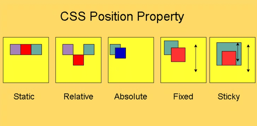
- static (default)
- All elements are static unless specified.
- They follow the normal document flow (stacking one after another).
- Offsets (top, left, etc.) are ignored.
- Commonly used for normal content.
|
<div style="position: static;">Static Box</div>
|
- relative
- Element remains in the normal flow but can be shifted using offsets.
- Space is still reserved in its original position (like an invisible placeholder).
- Useful when you want slight adjustments without breaking layout.
|
<div style="position: relative; top: 20px; left: 10px;">
  Relative Box
</div>
|
- absolute
- Element is removed from normal flow (it doesn’t push other elements).
- It is positioned relative to the nearest ancestor that has position set (not static).
- If no ancestor is positioned, it uses the document body.
- Often used for tooltips, dropdowns, popups, etc.
|
<div style="position: relative;">
  Parent
  <div style="position: absolute; top: 10px; left: 20px;">
    Absolute Child
  </div>
</div>
|
- fixed
- Element is positioned relative to the browser window (viewport).
- It does not move when the page is scrolled.
- Common for sticky navigation bars, floating buttons, or chat widgets.
|
<div style="position: fixed; bottom: 0; right: 0;">
  Fixed Box
</div>
|
- sticky
- Hybrid of relative and fixed.
- Starts as relative (moves with the document flow).
- Once scrolled beyond a threshold, it "sticks" like fixed.
- Great for sticky table headers or section titles.
|
<div style="position: sticky; top: 0; background: yellow;">
  Sticky Header
</div>
|