Flexbox in CSS (Lecture 5)


Introduction

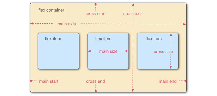
Flexbox (Flexible Box Layout Module) is a modern CSS layout system that provides an efficient way to arrange, align, and distribute space among items in a container. Unlike traditional methods (float, table, inline-block), Flexbox is direction-aware and adapts easily to different screen sizes, making it very useful in responsive web design.


Main Concepts

  1. Flex Container

    • The parent element with display: flex; or display: inline-flex;.
    • Defines a main axis (horizontal if row, vertical if column) and a cross axis (the opposite).
  2. Flex Items

    • The direct children of a flex container.
    • Their size and alignment can be controlled independently or as a group.

Flex Container Properties


Flex Item Properties


Advantages of Flexbox

  1. Easy centering (both vertically and horizontally).
  2. Automatic equal spacing distribution.
  3. Flexible resizing for dynamic content.
  4. Simplifies responsive design (adapts to screens).
  5. Can reorder items without touching HTML.
  6. Reduces the need for float, table, and position hacks.

Limitations

  1. Designed for 1D layouts (row or column).
  2. For full 2D layouts (rows + columns together), CSS Grid is better.
  3. Complex nested flex structures can sometimes be confusing.


See the video lecture